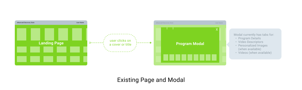
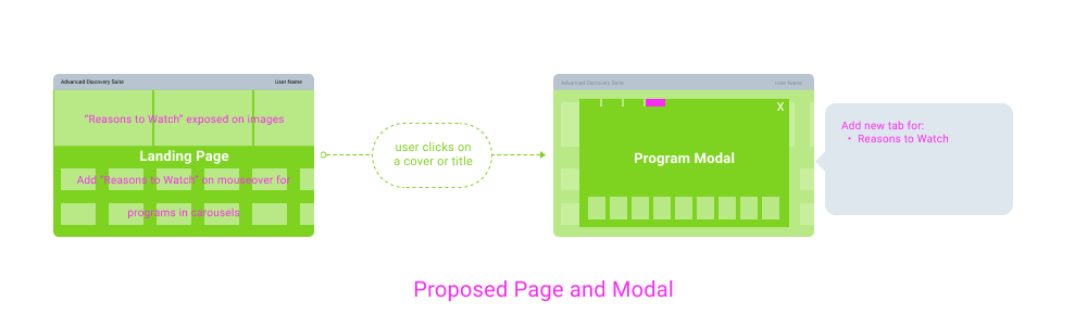
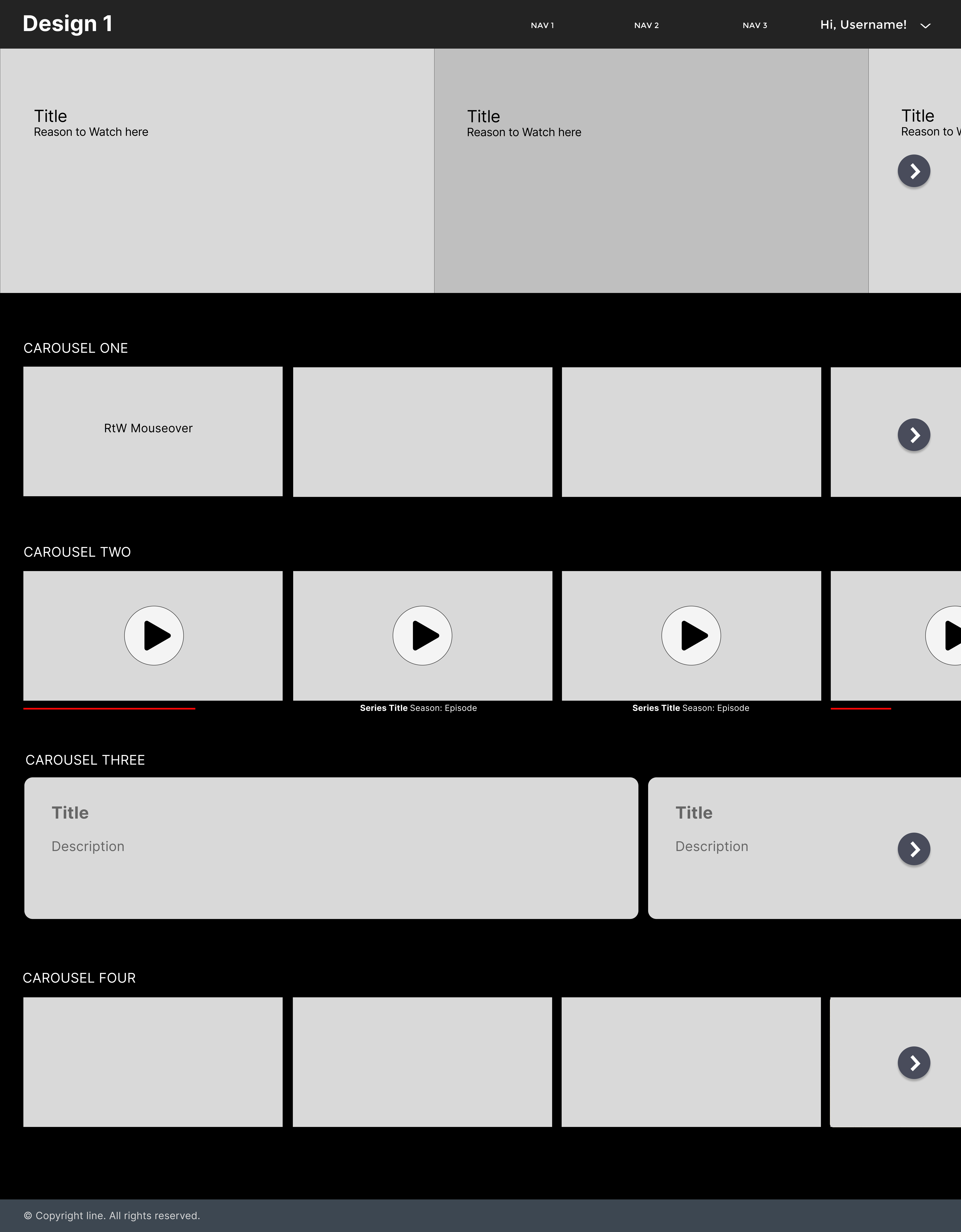
Reasons to Watch

Reasons to Watch was a feature that we added to the Advanced Discovery Suite, a tool used by salespeople and others to demo new video metadata offerings at trade shows and meetings. The feature was driven by the question, "How can we encourage streaming video users to click through to actually watch any particular program?" The screen recording shows the user navigating the site to uncover the Reasons to Watch, as well as other features including Video Descriptors and Personalized Images and Videos.

To see a Case Study of how this project was designed, scroll down.

PREVIOUS PROJECT

BACK TO PORTFOLIO

NEXT PROJECT

Case Study:
Reasons to Watch

Part 1 - Design Brief

The objectives for this project were two-fold:

  1. Design a compelling narrative around a new “Reasons to Watch” feature being added to an existing video demo.
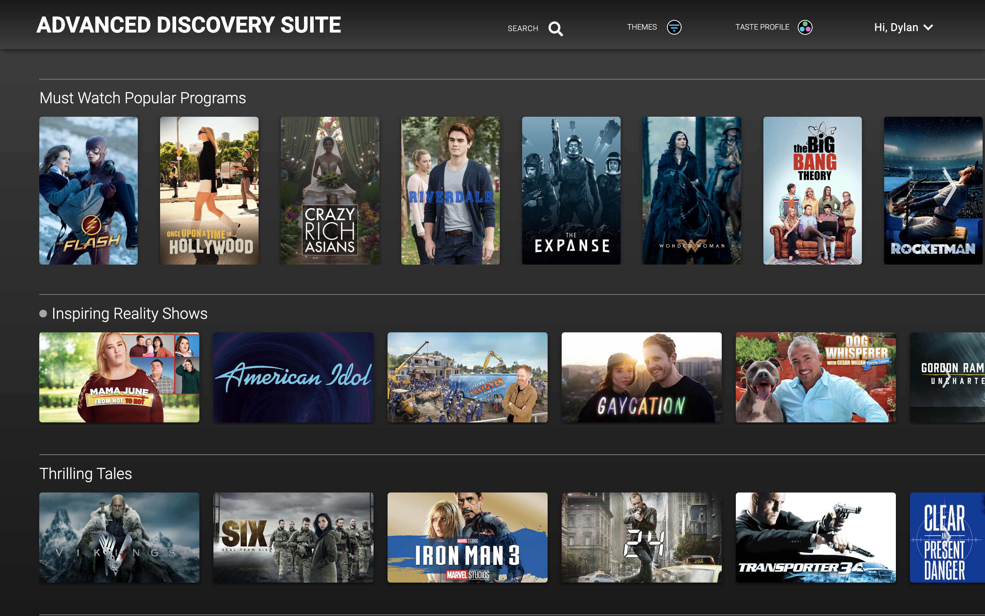
  2. While doing so, modernize the look & feel of the demo, which was looking a bit outdated. (The original demo landing page is at right.)

As always, we began the project using a design thinking framework that asks:

  • Why are we doing this?
  • Who are we building this for?
  • When and where will the feature/demo be used?
  • What is/are the solution/s to the problem?
  • How can we measure the success of our design?
advanced discovery suite before

Part 2 - Design Process

A kickoff meeting with stakeholders led to the answers to Why, Who, When and Where:

Research into what the major SVOD companies are currently doing informed the What answer:

existing user flow diagram
proposed user flow diagram

Wireframes

I produced two initial designs for the landing page; these were presented for stakeholder review:

design 1
design 2

Implementation

After wireframe Design 2 was selected as the preferred layout, "pair programming" work with a developer began. I supplied the developer with a prototype in Figma, which they used to build the app in React. Once deployed to our gitlab environment, we each worked on designated aspects of the project in separate branches, merging when appropriate. We worked quickly to iterate and refine the design. Design reviews with stakeholders were held bi-weekly, and the primary discussion revolved around the navigation for the hero carousel. After determining that images were preferred over a dot navigation, three solutions were proposed:

design 1
design 2
design 2

Release

Ultimately, the third design was selected. Below is the before and after for this redesign. A video screen capture of the user clicking through various features in this app is available above. I would be happy to walk through this with you to provide more detail.

advanced discovery suite before
final design

Part 3 - Analytics

Surveys to determine the How:

BACK TO TOP